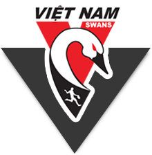
The Vietnam Swans have unveiled our new Club logo (see above on white and black backgrounds) which was designed by Ross McRae. Preliminary indications are that it is a mega hit.
For some time, we had been thinking that our previous Club logo, which was very similar to that of the Sydney Swans’, needed to be updated.
The new logo retains the red “V” which stands for “Vietnam” and keeps a link to the Sydney Swans. The neck and head of the Swan have been retained but beefed up to symbolise strength and power. Additionally, they are no longer “trapped” by the confines of the “V”.
The running/kicking man has been incorporated into the design. It’s the signature action shot of Australia’s signature sport and that’s why it’s important to have that image incorporated into the Vietnam Swans official logo.
Finally, the colour black has been included to reflect the fact that it has been an official colour of the Club for several years now.
The Swans National, Saigon and Hanoi Committees thank Ross McRae very much for the amazing logo he has designed. It’s yet another magnificent design by Ross.
If your company requires some professional design work, contact vietnamswans@gmail.com and we’ll put you in touch with Ross.
Now, back to you. Do you love the Club’s new logo? Vote now!
[polldaddy poll=5220892]


