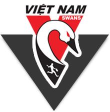
Is the current Swannies logo out of date?
We’ve asked Gun Designer and Swannies Aficionado Ross McRae to test the waters by designing some new sample logos which are reproduced below. And we want your feedback. Now.
Which of these logos will best represent the Club in the 21st Century?
Background of the current logo
The current logo is modelled off the Sydney Swans logo (previously, we wore the Sydney Swans jumpers). It uses the Sydney Swans’ red “V” and the same Swans head. The Sydney Opera House is replaced with a yellow star symbolising the star on Vietnam’s National Flag (it’s not a solid yellow star due to sensitivities about how the National Flag can be used).
A new Club logo
The main issue with the current logo is that, at a quick glance, it looks very much like, not surprisingly, the Sydney Swans’ logo. Arguably, our logo, needs to be more distinctive reflecting the changes made to our redesigned jumper; eg the Swan now has a completely different head and black has been added as a major colour.
The “V” remains important to the design as it also stands for “Vietnam”.
What do you think? Check the choices and then vote in the poll beneath the logos.
[polldaddy poll=5107946]


