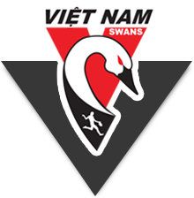
Based upon your feedback in the first poll regarding a new Swannies logo, Ross McRae has gone back to the drawing board.
One thing we noticed was that some of the designs were becoming quite complex and busy. There was also an element of thinking that our footy jumper already has a full Swan on the front. Including a full Swan in our logo could start to look funny.
So, it was back to basics and simplicity – as is the case with many of the most famous brands today. Simplicity meant retaining just the head and neck of the Swan, as is the case with our original logo.
Please note, that the logo can sit on any background colour. In this particular illustration, the background colour is black.
The Designs:
So now, vote for your favourite logo!
[polldaddy poll=5125938]


